
Mobile Optimization: What Is It & How to Optimize It

Mobile optimization refers to ensuring that a website, blog, or application is optimized for viewing effectively and efficiently on mobile devices such as smartphones and tablets. This involves designing and formatting your content to be easily readable, navigable, and loadable on smaller screens.
The functionality and sophistication of mobile technology increased. With more customers using mobile devices and channels than ever before. It’s never been more important for marketers to evaluate the strength of their mobile offering and take steps to improve it.
What is Moblie Optimization?

Mobile optimization is the process of ensuring that visitors accessing your website from mobile devices have an engaging and user-friendly experience that’s been optimized for that specific device. Rather than simply compressing or rearranging content on a screen, a mobile-optimized site is designed entirely for a smaller screen user’s experience. This means diving into user behavior on mobile, finding friction points, and improving the knowledge to improve the conversion rates.
For instance, say you’re digging into your data and notice that your main call-to-action (CTA). It is buried below the first fold of your mobile version of the webpage, leading to fewer clicks.
Why is Mobile Optimization Important?

Optimizing for mobile encompasses the entire customer experience, and when done properly, it compliments every interaction a customer has with your brand. Mobile optimization is important for several reasons:
1. Increased mobile usage: Most users access websites and apps on mobile devices, making optimization crucial for a good user experience.
2. Improved user engagement: A mobile-friendly design leads to higher engagement, longer session times, and lower bounce rates.
3. Better search engine rankings: Google prioritizes mobile-friendly websites in search results, improving visibility and SEO.
4. Competitive advantage: A mobile-optimized website or app can set you apart from competitors and establish your brand as modern and user-centric.
5. Conversion rate optimization: Mobile optimization can lead to higher conversion rates, as users can easily navigate and complete tasks on mobile devices.
6. Enhanced brand reputation: A mobile-friendly experience reflects positively on your brand, showing you care about user experience and accessibility.
7. Increased sales and revenue: By providing a seamless mobile experience, you can increase sales, revenue, and overall business growth.
In summary, mobile optimization is vital for delivering a great user experience, improving engagement, boosting search engine rankings, and driving business success.
How can you optimize for mobile devices?

Optimizing for mobile devices involves several key strategies to ensure that websites and applications perform well. And to provide a positive user experience on smartphones and tablets. You must’ve realized how crucial mobile optimization is for sustaining business growth. But how exactly do you optimize your website for mobile? Here are some effective ways to optimize for mobile devices:
1. Start with responsive web design

There are various ways to ensure your site is optimized for mobile and how you go about this will depend on the type of site you operate. In general, it’s best to use a clean, minimal design. That isn’t so easy, though, if you run an e-commerce site packed with many products or services. In this case, it’s important to choose a web design that’s 100% responsive.
Responsive web design is foundational to optimizing websites for mobile devices. It involves creating websites that automatically adjust their layout and content based on the screen size, orientation, and capabilities of the device being used. This approach ensures that users have a consistent and optimal viewing experience across devices, from smartphones and tablets to desktop computers.
By responsive design techniques, such as flexible grids and layouts, CSS media queries, and scalable images. And web designers can prioritize content effectively and ensure that navigation remains intuitive and accessible on smaller screens. Responsive design provides you with the building blocks enabling you to create a fully mobile-ready site. Your site will look attractive and be more easily navigable to users, and this will help to increase conversions.
2. Analyze friction points with a behavior analytics tool:
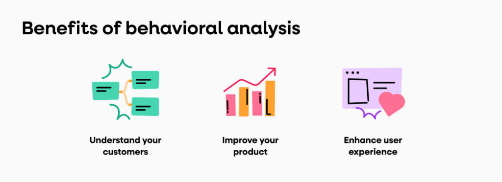
Behavior analysis tools are like your online detective buddies, showing you where users stumble and where they breeze through. They track clicks and scrolls, even with features like heatmaps and session recordings. So, before you jump into the design change phase, take a peek at how users interact with your site. Check out how they handle those crucial CTAs and forms.
For instance, you can look at this heatmap report from a mobile site. It shows the visitor’s engagement with website elements and helps you with clever design fixes.
Heatmaps are another valuable tool that visually represents user interactions on web pages. By highlighting areas where users click, scroll, or spend the most time. Heatmaps reveal which parts of the page attract attention and which are ignored. Areas with low engagement may indicate content that is not relevant or intuitive enough, signaling potential friction points that need optimization.
Conversion funnels within behavior analytics tools track users’ journey through key steps, from landing page to checkout. Analyzing funnel data helps businesses pinpoint where users drop off and abandon the process. This could be due to overly complex forms, unclear calls to action, or technical issues.
3. Build mobile-friendly website features:

On a mobile-optimized site, the images are lighter so the site loads more quickly, while buttons are sized to accommodate broader fingers. They’re usually designed to reduce the need for pinching and scrolling.
When optimizing for mobile, text is short and easy to read with minimal steps to conversion. Viewers need to be reassured that their details are safe, so optimized sites generally offer a range of payment options. Which include ones that don’t require the entry of credit card details such as PayPal, Apple Pay, or Google Pay.
Navigation menus should be simplified and ideally implemented as a hamburger menu to save space and enhance accessibility. Interactive elements such as buttons and links should be sufficiently large and spaced apart to accommodate touch gestures accurately. Optimizing media content for faster loading times on mobile networks is crucial. It achieved by compressing images and videos and minimizing unnecessary scripts.
4. Create accelerated mobile pages (AMP)

AMP helps website owners cater to mobile users, especially those with slow internet connections. AMP, a framework by Google, focuses on speed, creating lightweight pages that load fast on mobile devices. By following AMP’s guidelines and restructuring HTML code, developers can create AMP versions of web pages, improving the mobile browsing experience. AMP implementation offers SEO benefits and better visibility in search results, making it a smart choice for engaging mobile audiences effectively.
Implementing AMP can significantly improve mobile SEO rankings due to its faster loading speeds and enhanced user experience, reducing bounce rates and increasing engagement. AMP is an open-source initiative that aims to improve the mobile browsing experience by prioritizing speed and performance. To create AMP pages, developers utilize a streamlined version of HTML, known as AMP HTML, which restricts certain elements and JavaScript to ensure faster loading times.
AMP pages are cached by Google’s CDN (Content Delivery Network), which further enhances speed by delivering content in proximity to users. Key components of AMP include structured data implementation for rich snippets in search results. AMP-specific tags for embedding videos, images, and other content, and the use of AMP components for interactive elements like carousels and accordions.
Benefits of a Mobile-Optimized Website

Responsive design helps ensure the mobile optimization of your website. This tends to cost more to develop, but it ensures the mobile optimization of every aspect of your website. Optimizing a website for mobile devices offers several significant benefits that enhance user experience. To improve engagement, and ultimately drive business success:
a) Improve your user experience:
User experience is essential. If you don’t provide a good user experience, visitors will leave and they won’t return. The mobile experience is much different from the computer experience. Visitors need to be able to read your web pages with ease, click links without zooming in, and navigate your site on a smaller screen. Without mobile optimization, users often struggle to read or navigate websites on mobile devices. Pages load faster, content is easier to read without zooming, and navigation is intuitive with touch-friendly buttons and menus. This leads to higher user satisfaction and encourages return visits.
b) Improve website speed:
When you optimize your website to meet mobile standards, then your website should load quickly. Websites that aren’t properly optimized for mobile often take a while to load, especially when they use Flash elements. Mobile users simply aren’t going to spend time on your site if they can’t get your pages to load. By improving the speed of your site, you’re more likely to keep visitors on your site for longer periods. Optimizing images is essential. Compress images to reduce file size without compromising quality. Use modern image formats like WebP, which offer better compression rates than JPEG and PNG.
c) Increase user engagement:
A mobile optimized website increases the likelihood of engaging your visitors. This is because visitors will spend more time on your site navigating through content. They will also be able to interact with your site, whether it be by liking content, clicking on CTAs, or even contributing to your comment sections. create high-quality, relevant content that resonates with your target audience. Content should be informative, valuable, and well-presented, addressing the needs and interests of your users. Regularly update content to keep it fresh and engaging, offering insights, solutions, or entertainment that users find useful.
d) Attract more local customers:
Mobile SEO is important to local SEO. Many people will perform search queries on the go when they are looking for a specific business. These people want to buy. If they are near your physical location and they find your website while doing a mobile search, they’re more likely to drop in and make a purchase. Poor mobile SEO will translate to poor local SEO, potentially hurting your ability to attract local customers. Optimize your website for local search. Ensure your business name, address, and phone number (NAP) are prominently displayed on every page, ideally in the footer or header. Create a dedicated “Contact Us” or “Locations” page with detailed information about your business hours, directions, and local landmarks.
e) Improve your mobile SEO:
A few years ago, your mobile SEO wouldn’t affect your regular SEO. However, due to how many mobile users there are now, Google has begun factoring a website’s mobile SEO into their regular SEO. This means that if you don’t have a website that’s optimized for mobile use, it will actually hurt your SEO. Ensure your website is mobile-friendly and responsive. This means that your site should provide a seamless user experience across all devices, with text that is readable without zooming, properly sized tap targets (buttons and links). And a design that adjusts fluidly to different screen sizes and orientations. Google’s Mobile-Friendly Test can help identify areas for improvement.
Grow Your Business With Mobile Optimization

Growing your business through mobile optimization involves leveraging strategies that cater specifically to mobile users, enhancing their experience and increasing engagement. Here are key steps to effectively capitalize on mobile optimization:
Firstly, prioritize responsive web design. Ensure your website is responsive, meaning it adapts seamlessly to different screen sizes and devices. This approach eliminates the need for separate mobile and desktop versions. We provide a consistent and user-friendly experience across all platforms.
Secondly, optimize page speed. Mobile users expect fast-loading websites. So optimize your site’s performance by compressing images, minifying CSS and JavaScript files, and leveraging browser caching. Fast-loading pages not only improve user experience but also reduce bounce rates and improve search engine rankings.
Thirdly, enhance mobile usability. Simplify navigation by using intuitive menus and clear CTAs (Call-to-Actions) that are easy to tap on touchscreen devices. Ensure that text is readable without zooming and that interactive elements are appropriately sized for mobile use.
Additionally, focus on local SEO. Many mobile searches have local intent, so optimize your website for local keywords and phrases. Claim and optimize your Google My Business listing, encourage customer reviews. And it ensure your business information is accurate and consistent across all online directories.