
The Importance of Responsive Web Design in 2025

In 2025, one will not be able to ask whether or not one needs a website that is responsive to any device. With mobile traffic now exceeding desktop usage, and a growing number of people accessing the web through smartphones, tablets, and wearables, the gravity of responsive web design (RWD) only gets higher. This ensures that the website achieves a good viewing experience on any device. With the ever-increasing demands of users any business that fails to embrace responsive design will invariably suffer the brand will earn a bad reputation and search engine rankings will be compromised. Responsive web design is now a prerequisite for competitiveness and for delivering seamless user engagement.
What is Responsive Web Design?
Responsive Web Design (RWD) is a web design method. That assures perfect auto-adjustment and scaling of layout, images, and content depending on screen size and devices. That are used to view the web pages. Instead of creating different websites for the desktop, tablet, and mobile variations, responsive design. Uses flexible grids, fluid images, and media queries to make a single unified design functioning uniformly on all devices. Now whether a user accesses your website from its desktop, a smartphone, or a tablet. The experience will remain optimized and consistent in terms of easy navigation, fast loading, and content adjusting to fit their screen. RWD is key to providing user-friendliness and improving the accessibility of websites in the multi-device world of the present.
1. Flexible Grid Layout
•Flexibly grid system whereby all elements are defined through percentages rather than fixed pixel sizes.
•This guarantees that the layout adjusts to various screen sizes from large desktop monitors to small mobile screens.
2.Fluid Image
•Images in a responsive design are sized in relative terms (percentages or max-width). Which allows them to resize depending on the device’s screen.
•Prevents images from breaking the layout or being too large for smaller screens.
3. CSS Queries
•Media queries allow the website to apply different CSS rules based on the device’s characteristics. Such as screen width, height, resolution, and orientation.
•Helps tailor the design to specific breakpoints, optimizing user experience on all devices.
4. Mobile-First Approach
Responsive design often follows a “mobile-first” approach Where the design is optimized for smaller screens first, then expanded for larger screens.
Prioritizes the mobile user experience, which is crucial given the rise in mobile internet traffic.

Why Responsive Web Design is Crucial in 2025
•Mobile Traffic is Again Dominating:
Most internet users nowadays are accessing the internet via mobile devices. By 2025 this dependency is only expected to increase. A responsive web design guarantees an optimal browsing experience without glitches across all devices whether it be smartphones tablets or desktops.
•Google’s Mobile-First Indexing:
Google has ultimately gone to a mobile-first indexing use -meaning. It predominantly bases website rankings in their search results using its mobile version. Sites that aren’t responsive or mobile-friendly can have poor placement within search engine ranking result pages. Therefore lowering the visibility and organic traffic to that site. It is extremely important that your site be responsive for good SEO purposes.
•Improved Experience for the User:
Websites are expected to load within seconds and be adaptable to virtually anyone’s screen size. Responsive web design guarantees that user experience is the same across devices. Thus directly catering to how users engage with your site. Bounce rates are reduced, and conversions are expected to have even a higher probability since users wouldn’t need to zoom or scroll excessively.
•Cost-Effectiveness:
Previously, companies had to build two websites: one for desktop use and one for mobile. This way could also become very expensive and time-consuming to maintain. Missing flood has taken heed and wove time and resources into bringing forward a single website that could work across the platforms.
•Better Conversion Rates:
A seamless and consistent user experience results in better conversion criteria. Be it to buy something, fill out a form, or create a new account with a newsletter. The actions are more likely to bring about the desired results due to an absence of poor formatting on the website when one is making use of it on different devices.
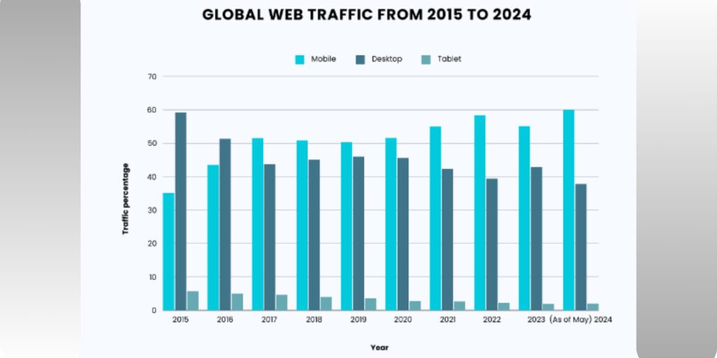
Mobile Traffic is Dominating
If trends shall continue, the year 2025 shall see an unprecedented dominance of mobile traffic in the digital scene. This is not a transient trend it is a paradigm shift in the ways people access the Internet and interact on it. The transition of mobile devices to the role of the primary mode of accessing websites. Social media, and e-commerce platforms, especially in the case of smartphones, initiates a totally new return characteristic. Discover why responsive web design is crucial for success in 2025 and beyond. Learn more here!
1.Increasing Usage of Mobile:
Statistically speaking mobile devices have in recent years generated over half of the global internet traffic share. With a steady increase since then. Ranging from web browsing to shopping email checking, and social networking. there seems to be no end to online activities users undertake via mobile.
2.On-the-Go Consumer Clusters:
Mobile users are constantly on the go these days whether commuting, traveling or simply multitasking during the day. This consumer behavior has shifted thereby making company websites be optimized for mobile to avail seamless and engaging experiences relative to location.
3.Surging Mobile-Shopping Sales:
The emerging boom of mobile commerce, m-commerce for short, has exploded. Many consumers would rather buy straight from their phones-whether shopping on e-commerce sites, booking a service, or purchasing digital products. Failure to have a mobile-responsive or mobile-optimized website would mean losing sales opportunities to competitors who deliver a better mobile experience.
Mobile traffic is set to develop more rapidly than desktop traffic. Which compels any businesses to make the websites highly responsive. Thus, users with all sorts of devices get a good experience. As responsive web design is fast becoming an enormous factor to stay relevant. Competitive, and accessible to an ever-increasing mobile audience, this is one feature that cannot be overlooked.
Improve SEO Ranking
In today’s digital realm, responsive websites do not only play an essential role in seamless user experience. They also work to enhance websites’ SEO rankings. With Google and the other search engines increasingly promoting mobile-first indexing. The responsiveness of a site is taken into consideration when ranking a site in the search results. Since that is the case, here are some reasons why a responsive website may further enhance the SEO rankings come 2025:
1.Mobile-First Indexing:
Google has now adopted mobile-first indexing, meaning it crawls and indexes the mobile version of your website first when determining rank. If your site is not responsive or mobile-friendly it could be penalized in search ranking by Google making it less visible.
2.Single URL For Every Device:
Responsive web design avoids the need to create separate versions for mobile and desktop which often causes the hassle of managing multiple URLs (for example site that has mobile version with a different URL). With the same single URL for both mobile and desktop, Google may efficiently crawl and index your content thereby enhancing your SEO.
3.Enhanced User Experience (UX):
Search engines, especially Google have made user experience a key factor in the ranking of their search results. A responsive design is characterized by an easy and simple to use interface with low bounce rate and high user engagement. Easy-to-navigate and fast-loading websites usually have low bounce rates, which indicate to search engines that the site probably holds some value for its visitors, thereby enhancing your ranking.
4. Pagespeed that gets a point:
Pagespeed is a very important ranking factor, and a responsive site generally ensures the content is optimized for fast loading regardless of the device. Long loading times may trigger a higher bounce rate from mobile users.
Better User Experience and Engagement
User experience (UX) is among the major reasons that contribute to the success of any website. By then, in 2025, it will be pertinent for a website to have responsive web design for the best user experience, no matter the type of device it’s being looked at from. Here’s how responsive web design enhances the user experience and increases engagement:
1.Smooth Experience in Browsers:
Besides the layout that needs to be easily changed automatically at the sight of the smallest device screen and even the biggest with the idea of a personal computer, it also makes a good design that enhances navigation and a user experience for people browsing through various smartphones, tablets, and computers. Due to a better and standard smooth navigation experience, it makes people stay longer and get involved with the content.
2.Improved Readability and Accessibility:
A responsive site allows the letters to be read without zooming in. The font size, spacing, and arrangement adapt according to the size of the screen so that users can read without difficulty. Whether it is a small mobile phone or a desktop, all the content is accessible and readable.
3.Faster Load Times on All Devices:
Speed of the website loading is an important factor in terms of user experience. Users want websites to load quickly even more so on a mobile device, where slow speeds prove to be agonizing at times. Thus faster load times mean better user experience; less chance of bounce, more chance of engagement and conversion.
4.Touch-Friendly Elements for Mobile Users:
Mobile users use touch to navigate websites; thus, touch considerations apply to design. A responsive website makes sure that buttons, links and forms are large enough and spaced properly to allow tactile navigation.

Cost-Effective
One of the most beneficial things about responsive web design is that it saves costs. Earlier on, companies had to develop separate websites or versions for their desktop and mobile consumers. This doubled the work for designers, developers, maintenance, and updates. On the contrary, a responsive design allows for a lesser effort-more efficient and cost-effective solution. Here are the ways how responsive web design saves on time and money:
1. A Single Site for All Devices:
The Responsive Web Design lets businesses build a single site across all devices, rather than having to design and maintain two separate sites for mobile and desktop users. This further avoids the doubly expense of extra content, code work and two sets of developer teams. One responsive site is the simplest to update, which helps keep the site current and functioning in an easy manner and with a cost-effective approach.
2. Lower Development Costs:
That can be quite the investment in developing and maintaining two different websites; one for desktops and the other for mobiles. Responsive web-design takes care of just this with a design concept that adapts to any screen size. This means further savings for the businesses in designing, developing and maintaining just one site.
3. Easy Maintenance and Update:
Traditionally any update or changes to a site would require revisions to both the desktop and mobile versions and these could take up time and money. In contrast, with responsive web design, any site-wide update will be instantly reflected in all versions, thereby producing consistency across the board. This cuts time spent on updates and reduces the chances of unfortunate errors or inconsistencies across site versions.
Future-Proofing Your Website
We live in a rapidly mutating digital space such that every business should brace itself for upcoming technologies, new devices, and changing consumer behaviors. One key strategy for making sure that a site remains relevant and functional in the long run is through future-proofing. A web design that is inter-generic and responsive comes in very helpful for making a website future-set by creating a flexible and easily manipulable platform that can henceforth accommodate any future technological advances. Here is why making it responsive is the key for future-proofing your website:
1. Adapts to New Devices:
A responsive website accommodates automatically a wide variety of devices with different screen sizes and resolutions. Whether new types of smartphones or wearable technologies come into play, a responsive website will make sure that users will see and use it ideally, no matter what new device consumers happen to embrace.
2. Compatible with Future Browsers:
The web is a living thing forever changing; new browsers and new versions of the same browsers tend to appear on the scene all the time. As responsive designs are based upon modern web standards, they guarantee compatibility with the latest technologies, which include new features of HTML5 and advances in CSS.
3. Immunization Against New Technology Complete Overhaul:
Responsive web design means there is no need to start from scratch again and redesign your website to cater to new technologies that come up, be it new mobile devices or an increase in the speed of the internet. The flexible nature of responsive design means your website will naturally adapt to new trends: saving costs and headaches for you in a massive redesign every time a new technology or device comes along.
Ready to future-proof your website? Invest in responsive Web Design today for seamless experiences across all devices!
Conclusion:
Of all the aspects that will be trending by the time 2025 rolls in, responsive web design is one of the foremost. Given the mobile traffic explosion and the forces of emerging technologies, it is essential to design a website that would give everyone a good user experience and provide the competitive edge. Responsive Web Design additionally gives accessibility and SEO rankings making sure your website is future proof and scalable. Responsive Web Design is an investment for engaging with a wider audience and maintaining pace with the fast-changing digital era.