
Introduction in InDesign Magazine Layout
Amongst other print and online mediums, InDesign Magazine Layout are still among the strongest storytellers. A good magazine layout ensures that your audience’s attention is captured and readability enhanced, while maximizing the potential of the content. It applies equally to a fashion magazine, a business publication, or an art magazine; a layout is vital for attracting readers.
Adobe InDesign has become the industry standard for InDesign Magazine Layout due to its powerful tools and flexibility in designing. Through these inputs, designers produce impressively organized and aesthetically appealing magazine pages, retaining tonality within the whole magazine. While software skills are necessary to set up a magazine layout beautifully, the set of tangible requirements extends beyond this to creativity, an eye on design principles, and attention.
This will be your guide through all the critical steps towards creating a coherent and impressive magazine design in InDesign. From planning your layout to choosing the right typography, colors, and imagery, we’ll cover everything you need to know to bring your magazine vision to life. Whether you’re just starting or a highly skilled designer looking for new tricks, this blog presents valuable insights to shape a magazine that stands out.
Planning Your Magazine Layout
Before you start, the foundation of a great InDesign Magazine Layout is well planned. A properly organized plan aids in relaying the visual appeal, cohesion, and communication of the magazine theme. Here are the main steps to consider while planning for your magazine layout:
Create stunning magazine layouts in InDesign by incorporating expert tips on typography, color choices, grid structure, and visual hierarchy.”

1. Define Your Purpose and Target Audience :Indesign Magazine Layout
The purpose of understanding the magazine is very vital in setting the right design tone. Here are a few questions you can ask yourself:
Is the InDesign Magazine Layout informative or lifestyle, fashion, or business oriented?
Who is your audience (young, professional, creative, etc.)?
Is the magazine going to evoke certain feelings or bring certain messages?
Once you define these, you will be able to cherry-pick the color, font, and imagery appropriate to your magazine theme.
2. Decide Page Size and Format
The design direction is influenced by the format of your magazine, be it print or digital. Here are common magazine sizes:
Print magazines: Generally sized at 8.5” x 11” (letter size) or A4
Digital magazines: optimized for mobile devices as well as desktop screens, e.g., 1080px by 1920px for digital readers
The right format ensures the legibility and ease of use.
3. Shape a Grid System
The grid system is also required for pulling everything into alignment and consistency across pages. It helps designers arrange text, images, and graphics in a well structured manner. Here are some most widely used grid types:
Single column layout: For simple and minimalist designs
Multi-column layout: For text heavy magazines (like newspapers or for business magazines)
Modular grid: More flexible structure for creative layouts
Using grids simplifies the balanced and highly professional-looking magazine.
4. Set Up Margins and Bleeds
Margins prevent the crowded feeling of the content while at the same, bleeds avoid cutting mistakes in printing. The regular sets include:
Margins: Normally 0.5″ to about 1″, depending on the design needs
Bleed: At least min of 0.125″ to avoid white edges after trimming Cuts of margins and bleeds are an essential factor in polishing a final product.
5. Select an Integrated Design Theme
A magazine must maintain a cohesive look and feel all over. Going through:
Typeface: Pick 2-3 complementary fonts for headlines, body text, and captions
Color Scheme: A palette that works well with the theme of the InDesign Magazine Layout and yet enables readability
Imagery Style: High-quality images that are in line with the imagery branding of the magazine
A cohesive design is suitable for making the magazine look professional and engaging.
6. Content flow: String together how content flows.
Let there be a smooth flow from one point to another in the arrangement of content. Good content flow would include:
Cover Page: Should be attention-grabbing and have a strong focal point.
Table of Contents: An index well-structured; easily accessible.
Feature Articles: Designed with good layout and use of engaging visual aspects and typography.
Advertisements: Strategically placed-in harmony with the balance maintained.
An organized feed of the InDesign Magazine Layout keeps the reader adequately engaged, enhancing the reading experience.
Creating an Appropriate Setup for Your InDesign Document : Indesign Magazine Layout
Before truly beginning the design of a magazine, it should be kept in mind that setting up the document properly in Adobe InDesign is rather important. This results in the smooth running of the design process while avoiding possible conflictations in formatting, thereby resulting in the provision of a more professional look to the magazine. The following are the steps to follow in order to set things off:
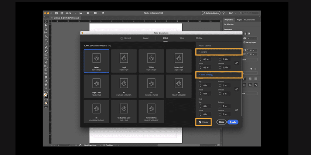
1. Begin by Creating a New Document : Indesign Magazine Layout
To get a new magazine project underway inside InDesign:
Open InDesign and click File > New > Document or press Ctrl + N (Windows) / Cmd + N (Mac).
Choose Print for a printed magazine, Web for an online magazine.
Choose the size of the pages according to the standard magazine dimensions (for example, 8.5 inches x 11 inches or A4).
Select the setting for Orientation (Portrait for a traditional magazine format or Landscape for wide layouts).
Select the Number of Pages (you can always add more later).
2. Set Up Margins and Bleed
Margins and bleed areas are two essential subjects for ensuring that your magazine is printing properly:
Margins: Set up a safe area where important content could not get cut off. Start with a minimum margin of 0.5 inches (12.7 mm).
Bleed: In case your design goes to the edge of the page, provide a bleed of 0.125 inches (3 mm) on all sides to allow for any white border that might show after printing.
Go to File > Document Setup to set the proper values.
3. Design Using A Spread Layout Using Facing Pages
Most magazines follow the spread layout, wherein two pages are put next to each other (just like an open book).
To create spreads, check the option for “Facing Pages” in the New Document dialog box.
This way, you can design across two pages for seamless transitions, especially for full-page images or extended articles.
4. Set Up Master Pages to Maintain Uniformity
Master Pages allow textbooks to mix in their layouts throughout the InDesign Magazine Layout:
Go to the Pages Panel (Window > Pages).
Double-click A-Master to edit the master page.
Add rosemary variables such as page numbers, headers or footers. Consistent text frames can be placed too.
Apply the master page to multiple pages in order to assist with the cohesiveness of your design.
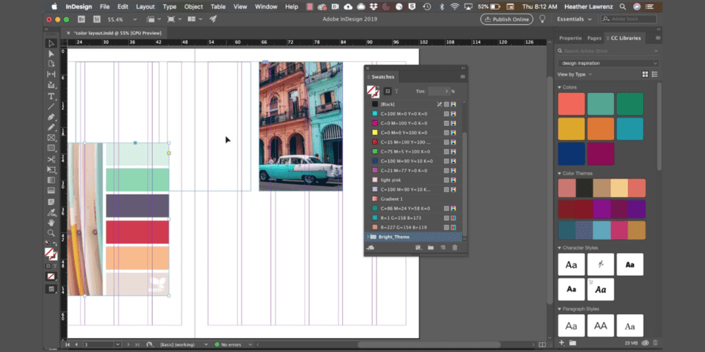
5. A Grid System Forms The Definition For Structure
Grids organize content and make levels of alignment:
Go to Layout > Margins and Columns, and set up multiple columns (i.e., 2-4 positioning per page).
If needed, align the guides (Ctrl + R/Cmd + R for rulers).
When properly structured, a grid translates text and image arrangement into balance and good readability.
6. Save Your Document As A Template
In case you end up designing several issues, saving this setup as a template will save time in the long run:
Go to File > Save As and choose InDesign Template (.indt).
This means you will be able to use the layout while maintaining the original file.
Getting the setup of your document right from the beginning will form a strong basis for designing a InDesign Magazine Layout that is professionally looking and attractive.
Typography and Fonts in Magazine Design
Typography significantly contributes to InDesign Magazine Layout as it affects the publication’s visual aspect, orientation and readability. The types and styling combination should help make the magazine visually strong, ensuring a smooth reading experience.

1. Choosing the Right Fonts
A proper balance must also be made while deciding on the font for the magazine so that it can be sassy and legible. In most cases, magazines use different font types in the various sections of a magazine.
Headlines: Bold, attention-grabbing fonts like serif or display typefaces would be suitable. Examples: Playfair Display, Baskerville or Futura.
Subheadings: A font that is slightly lighter or condensed to create the hierarchy. Examples: Montserrat, Open Sans, or Lora.
Body Text: Fonts are very readable and clean for long passages. Examples: Garamond, Times New Roman or Roboto.
It is advisable to have two or three types of complementary font type to keep it really professional-looking and cohesive.
2. Font Hierarchy for Visual Flow
A well-structured hierarchy of fonts is important, as it helps the readers in moving through the text both smoothly and completely. So, implement it in the following manner:
Headlines with Large Fonts: Make headlines stand out in sizes 24-40 pts.
Subheadings Should Be Noticeable but Not Overpowering: Use 14-18 pts to distinguish them from the body text.
Body Text for Readability: Make it 10-12 pts to ensure comfortable reading.
Bold and Italics for Emphasis: Use sparingly for key points or a quote.
3. Kerning, Leading, and Tracking
Under these headings comes applying perfect spaces in magazine layout design.
Kerning: Space which is adjusted between particular letters within a word. Mostly done for titles and logos on titles to avoid clumsiness.
Leading: This indicates space allotted within lines of text. Proper setting of leading ensures readability(usually 1.2 times multiplied by font size).
Tracking: Controls spacing across a whole word or paragraph. Slight increase in tracking in long-form text improves clarity.
4. Aligning Text for a Clean Layout
Typographic alignment really contributes to the structure all in all:
Left-Aligned: Most Natural and readable for body text.
Justified: Makes blocks of uniform shapes within text.one it is printed, spacing should, however, be adjusted by hyphenation.
Centered: Best for things like headlines, captions or even as decorations.
Right-Aligned: These are rarely used and only occasionally have use as stylized magazine designs.
Color Schemes and Imagery in Magazine Design :InDesign Magazine Layout
Colors and images are key components in determining the whole look and feel of a magazine. A color scheme well-thought-out has not only improved the readability but also put the mood and identity of a brand. On the other hand, beautiful pictures satisfy visual demand making that magazine even more enjoyable to its readers. Here are some tips on how to apply the color and imagery effectively in your magazine layouts:
1. Choosing the right color palette
An effective color palette maximizes its potentials in creating a highly professional and visually pleasing layout of a magazine. Some of the essential points to take note include:
A. Understand on what the magazine speaks about and who reads it.
Soft pastels, bold contrast, and elegant monochromes are all very usable hues in a fashion or lifestyle magazine.
Sleek, modern colors like blues, grays, and whites might work well for a business or technology magazine.
Bright and cheerful colors like reds, yellows, and blues with their primary shades will work well for a children’s magazine.
B. Work with 60-30-10 rule.
2. Use Quality Imagery: InDesign Magazine Layout
Images animate the magazine, divide the pages, and break up lengthy areas of text into palatable bites. Here is the best way to optimize imagery use:
A. Get Pictures at a Great Resolution
Use photographic images of at least 300 DPI for print and minimum 72 DPI for digital formats. Like the pixelated or blurry images do not speak well of a magazine in terms of how ‘professional’ it may seem.
B. Keep the Visual Hierarchy
A large, dramatic image should be featured on the cover page or at the front of leading articles. These supportive images will be smaller and enhance text content without overpowering it. Place very will-managed images all over the layout to lead the reader’s eye.
C. Image Cropping and Framing
Crop images very well with important things kept in focus. Glue pictures seamlessly into the layout with frames or borders.
D. Text Wrapping and Overlays
Hence text wrapping with the images adds that ever-dynamic flow to the article.
E. Consider Consistency in Image
Style Stick to a consistent photo filter or editing style to maintain cohesiveness. Ensure all images align with the magazine’s tone-vibrant and electric.
3. Collage of Colors and Images-Tools to Create a Strong Impact
An exciting and consistent magazine design can be achieved by:
Unifying the images with the selected color scheme
Using different tones for images to suit the general layout better
Utilizing bold colors to call attention to titles, headings, and highlights
Using gradients or duotones or overlays to provide a trendy flair.
Once you know how to weave color schemes and artwork into your designs, the result will be both incredibly stimulating and eye-catching. Striking a perfect balance means that images enhance the content instead of detracting from it, creating an exciting reading experience.
Making Interactive Page Designs
An enticing layout forms the backbone of any well-structured magazine. It keeps readers engaged, enhances readability and presents the content in an engaging manner. Below are some noteworthy considerations while developing the layout of a magazine in Adobe InDesign.

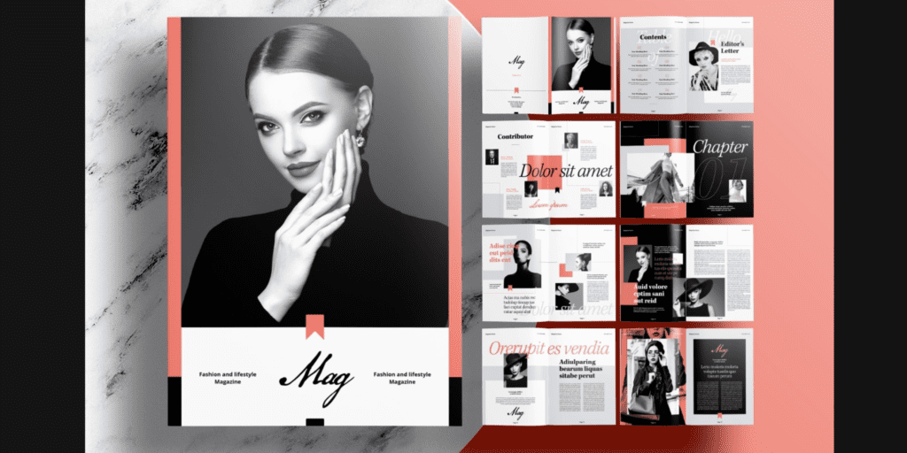
1. Design the Cover Page to Attract Attention in InDesign Magazine Layout
The cover page is the first thing glimpsed by a reader; thus, it must be eye-pleasing. Following steps can enhance the overall look.
Include a bold and bright headline announcing the main feature of the magazine.
Use an impressive image and/or illustration that corresponds faithfully with the theme.
Use the contrast of text and background colors so that they are easy to read.
It must be spacious; a balanced interlay of text and white space is important.
Use corporate colors and fonts related to the identity of the magazine
2. Create a Visual Hierarchy : InDesign Magazine Layout
A good layout allows the reader’s eye to glide over the page smoothly. Following are some possibilities of achieving that:
More significant typeface for headings; mid-size for subheadings; smallest for body text.
Important words should be boldfaced or italicized to achieve emphasis.
Essential content should be located at the top or center of the page.
Experimenting with asymmetry will guarantee excitement and vitality yet should never lose balance.
3. Balance Text and Images in InDesign Magazine Layout
In a magazine layout, one should never overwhelm with either text or images. Balance is the key:
Columns and grids give neat organization to the content.
Let images and text wrap so that they can work together for the continuity.
Keep text from being monotonous by adding pull quotes, images, or other subheadings, and don’t make it boring with big text blocks.
Make sure there is space separating elements for an uncluttered look.
4. Using White Space to Differentiate
White space (or negative area) characterizes every design that aids in readability and aesthetics.
It controls the visual clutter, thus assisting to eat away at the content.
White space flanking text and images allows for a concentrated focus on pertinent areas.
It modernizes the feel of the magazine and gives it sophistication.
5. Changes in Layouts Should Be Explored
Different magazine genres demand different approaches to layout. Following are some examples:
Grid-Based Layouts: Perfect for well-structured and rather formal magazines (for instance: business or fashion magazines).
Free-Flow Layouts: These could work for more creative and artistic magazines (for instance: lifestyle, or photography magazines).
Feature Spreads: Full-page imagery with minimum text works best for interviews and other special articles.
Enhancing with Graphics and Effects InDesign Magazine Layout
After establishing the structure, typography, and imagery of the InDesign Magazine Layout, the next enhancement will be through graphics and effects. This phase gives fill and life to the designs, making them visually appealing and interesting for the reader. Here are some techniques to further your magazine treatment using Adobe InDesign:
1. Custom Shapes or Iconography InDesign Magazine Layout
Shapes and icons appeal and add emphasis to important sections. Creating and manipulating vector shapes can be done using the Pen Tool and the Shape Tools (Rectangle, Ellipse, Polygon, etc.). You can:
Use geometric shapes to frame or hold content as a design element.
Add icons to these sections to make them interactive and interesting.
Get asymmetrical for a fresh and modern feel.
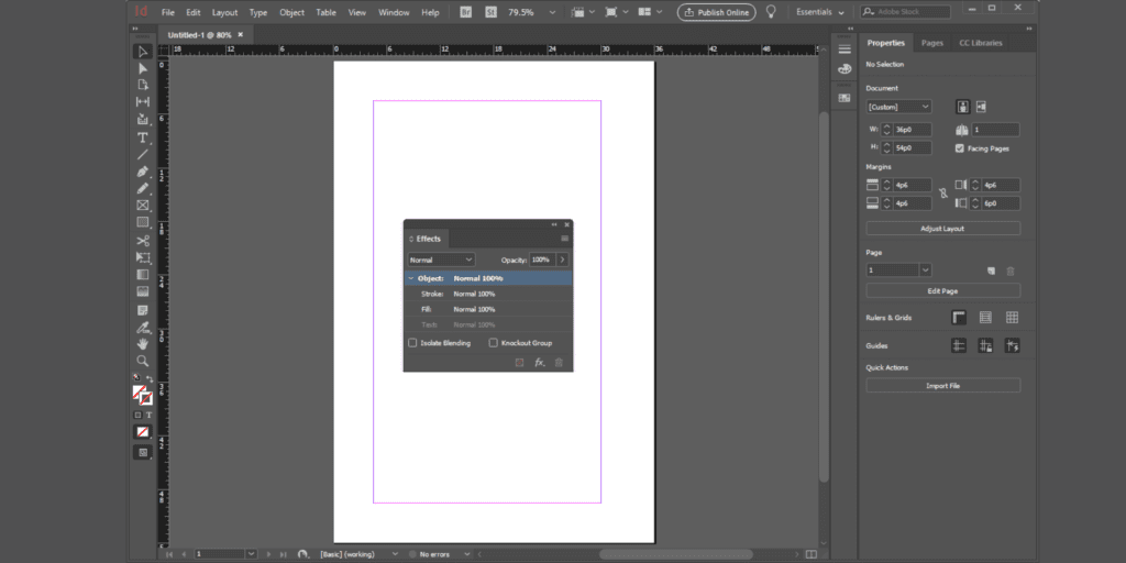
2. Drop Shadows and Glows
The addition of subtle effects, such as drop shadows or outer glows, can serve to call attention to text or images without cluttering the page’s design. Such effects may be added by:
Select and object or text and choose Effects > Drop Shadow (or Outer Glow).
Play with opacity, spread, and blur until it seems natural.
Use shadows moderately to ensure a tidy, professional-looking design.
3. Transparency and Blending Modes InDesign Magazine Layout
Transparency effects allow certain elements to be made semi-transparent, thus creating layered visuals. You can do the following:
Overlay images with text while keeping visibility in the background.
Blend colors and textures by adjusting opacity settings.
Experiment with Blending Modes (Multiply, Overlay, Soft Light) to blend images.
4. Textures and Patterns
Textures can help engage the audience by making the pages of the magazine feel much more tactile. You can:
Use richly detailed textures such as paper grain, watercolor effects, or the pattern of a fabric to enhance the unique look.
Set the textures against a backdrop, while always considering readability.
Adjust the transparency of these textures and blend them into the background through InDesign’s Effects Panel.
Finalizing Your Magazine and Exporting it in InDesign Magazine Layout
Of course, once you’ve finished your magazine design, you’ll need to have an eye on polishing up the work-in-progress, making sure that it is formatted properly for printing or digital distribution. Here are the steps for finalizing your InDesign project and exporting it quickly.

1. Proofreading and Layout Review InDesign Magazine Layout
Every single page should be meticulously checked for errors before export. What to look for: Text Errors: Typographical errors, grammatical errors, or text that may have been omitted Alignment Error: Make sure that all text and images and elements align correctly Quality of Image: Ensure that all the pictures are in high resolution, well-positioned, and proportionate Consistency of Fonts: Ensure uniformity in all fonts and typography styles across all pages
1. Checking for Missing Links and Fonts
The Links Panel (Window → Links) can be used to check for missing or broken links to images; make sure all fonts are embedded and that no missing fonts appear in the Find Font dialog (Type → Find Font);
2. Preflight Tool
InDesign has a Preflight Panel (Window → Output → Preflight) that can help detect: Low-resolution images Missing fonts or links Overset text (text hidden outside the text frame) Wrong color settings (RGB vs. CMYK) Resolve any issues noted before exporting.
Conclusion in InDesign Magazine Layout
Creating a beautiful magazine layout in InDesign is a journey of creativity, horizontality, and an eye for detail. Considering your layouts, grids, and master pages for uniformity, as well as typographic choices and images, goes a long way in creating an extremely visual and professional work of art. Colors, graphics, and whitespace can highly affect the finished look and feel of the magazine and let every page breathe with visual appeal and navigability. Finishing the design with proofreading and exporting in the right format will help ensure a beautiful work of art. Be it a fashion magazine, a corporate publication, or a lifestyle journal, these skills in InDesign will allow your creations to assume life in elegance and professionalism.