
AI can generate images, suggest layouts, enhance photos, create variations, and optimize designs for different platforms. It helps designers save time, boost creativity, and focus more on strategy and storytelling rather than manual work.
1. Understanding AI in Graphic Design
Understanding AI in Graphic Design means knowing how AI tools help designers create visuals faster and smarter. AI supports tasks like layout ideas, color selection, image editing, and automation, while human creativity, thinking, and storytelling remain essential.
A. What Is AI in Graphic Designing?
AI in graphic designing refers to the use of artificial intelligence to assist designers in creating visuals, layouts, and creative assets. AI tools analyze data, design patterns, and user preferences to automate repetitive tasks and support faster, smarter design decisions.
B. Popular AI Design Tools Today
Many modern design tools now include AI features. Platforms like Canva, Adobe Firefly, Midjourney, and Figma AI help with image generation, layout suggestions, color matching, and content resizing, making design more accessible and efficient.
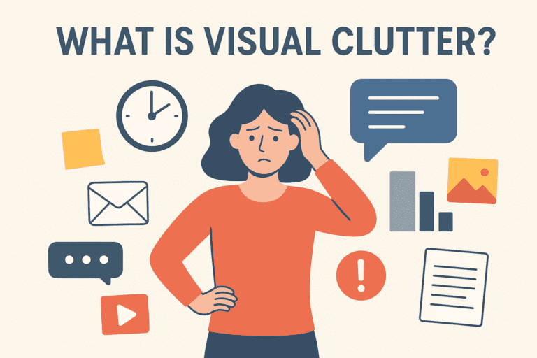
C. What AI Can Do in Graphic Design
2. Why People Think AI Will Replace Graphic Designers
People believe AI will replace graphic designers because AI tools can quickly create designs, logos, and images with minimal effort. Automation, fast results, low cost, and easy access make some think human designers may no longer be needed.
A. Automation of Basic Design Tasks
AI can handle repetitive tasks like resizing images, adjusting layouts, and applying templates. This automation makes design faster and leads people to believe human designers may no longer be needed for basic work.
B. Faster Design Creation With AI Tools
AI-powered tools can generate designs within seconds, creating the impression that AI can replace designers. This speed often hides the deeper creative thinking, strategy, and human insight required to build meaningful, original, and high-impact designs that truly connect with audiences.
C. Cost Reduction for Businesses
Using AI tools can reduce design costs for businesses, leading many to see AI as a cheaper alternative to hiring professional designers. This belief is especially common for simple, repetitive, or high-volume design tasks where speed and efficiency matter most.
D. AI-Generated Logos, Posts, and Templates
AI can generate logos, social media posts, and templates automatically. While impressive, these outputs often lack originality and brand depth, but they fuel the belief that AI can fully replace designers.
3. What AI Cannot Replace in Graphic Designing
AI cannot replace human creativity, original thinking, emotional understanding, and storytelling. Designers bring cultural sense, brand strategy, client communication, and unique ideas that AI cannot truly feel, imagine, or personalize like a human mind.
A. Human Creativity and Original Thinking
AI works on patterns and data, but it cannot truly innovate or think creatively like humans. Original ideas, unique concepts, and artistic intuition come from human imagination, not algorithms.
B. Emotional Intelligence and Design Psychology
Design is about emotion and connection. Human designers understand feelings, cultural context, and user psychology, enabling them to craft visuals that resonate deeply, tell meaningful stories, and build genuine emotional connections with audiences.
C. Brand Storytelling and Strategy
Strong design tells a brand’s story and supports long-term strategy. While AI can generate visuals quickly, it cannot define brand identity, values, or messaging with the strategic depth, consistency, and purpose that brands need to grow and stand out.
D. Understanding Client Vision and Feedback
Designers collaborate closely with clients, interpret feedback, and adapt creatively throughout the process. This human interaction, empathy, and ability to understand nuanced needs and expectations cannot be replicated or replaced by AI-powered tools.
4. How Graphic Designing Is Changing (Not Ending)
Graphic design is evolving, not ending. Manual design is shifting to smart, AI-assisted tools. Designers are becoming creative directors, guiding vision and strategy. Collaboration between AI and humans enhances efficiency and creativity, ensuring designs remain innovative and impactful.
A. From Manual Design to Smart Design
Graphic designing is evolving from fully manual processes to smart, AI-assisted workflows. Designers now use AI tools to automate repetitive tasks, streamline production, and explore new creative possibilities, making design faster and more efficient.
B. Designers as Creative Directors
Instead of being replaced, designers are shifting toward strategic and creative roles. They guide the overall vision, ensure originality, and make key decisions that AI cannot replicate, acting as creative directors rather than just executors.
C. Collaboration Between AI and Designers
AI is becoming a collaborative tool, not a replacement. Designers use AI to generate ideas, test layouts, and speed up processes, while adding human creativity, emotion, and strategy to produce compelling, unique designs. This synergy enhances productivity and innovation in the design industry.
5. New Skills Graphic Designers Must Learn in 2026
Graphic designers need to adapt to emerging technologies and trends. Key skills include AI-assisted design, 3D & AR/VR creation, motion graphics, UX/UI design, data visualization, brand storytelling, sustainable design, and basic coding for interactive projects.
A. AI Tool Knowledge and Prompt Skills
Designers need to master AI-powered tools and learn how to craft effective prompts. By understanding AI’s capabilities, they can enhance creativity, streamline repetitive tasks, and produce high-quality visuals more efficiently while maintaining their unique creative vision.
B. Branding and Strategy Thinking
Beyond visuals, designers must think strategically. Mastery of brand storytelling, positioning, and visual strategy ensures that every design aligns with long-term business goals, strengthens brand identity, and engages audiences effectively.
C. UX/UI and User-Centered Design
Designers should prioritize user experience and interface design. By understanding usability, accessibility, and interaction principles, they can create intuitive, engaging digital products that effectively meet user needs and enhance overall satisfaction.
D. Motion Graphics and Video Design
With video and animation dominating digital media, mastering motion graphics and video design is essential. These skills enable designers to craft dynamic, interactive, and highly shareable content across platforms.
6. AI as a Tool, Not a Replacement
AI as a Tool, Not a Replacement means using artificial intelligence to assist and enhance a designer’s work rather than replacing human creativity. AI can speed up tasks, generate ideas, and automate repetitive work, but human insight, emotion, and strategic thinking remain irreplaceable in design.
A. How Designers Can Use AI to Work Faster
AI helps automate repetitive tasks like resizing, color matching, and layout suggestions, allowing designers to focus on creativity and strategy while speeding up their workflow.
B. AI for Inspiration, Not Final Output
Use AI to generate ideas, explore variations, or brainstorm concepts, but always enhance them with human creativity. The final design should showcase original thinking, ensuring it’s more than just an AI-generated output.
C. Improving Productivity and Creativity
Combining AI efficiency with human creativity lets designers experiment freely, test concepts faster, and produce unique, high-quality visuals—boosting both productivity and innovation.
7. Career Opportunities for Graphic Designers in the AI Era
AI is changing design, but not replacing human creativity. Designers can explore new roles like AI-assisted design specialists, motion graphics creators, UX/UI designers, brand strategists, and data visualization experts. Collaboration with AI boosts productivity and opens paths in digital marketing, interactive media, and immersive experiences.
A. AI-Assisted Design Roles
Designers can specialize in using AI tools to streamline workflows, generate ideas, and optimize content creation. Emerging roles include AI design specialists, prompt engineers, and creative technologists, blending creativity with technology.
B. Brand Designers and Creative Strategists
With AI managing repetitive tasks, designers can concentrate on brand identity, visual storytelling, and strategic direction, enabling businesses to communicate more consistently and effectively.
C. Social Media and Digital Marketing Design
With rising demand for engaging visuals, designers skilled in social media content, ad creatives, and digital campaigns can merge AI efficiency with creative flair to deliver maximum impact across platforms.
D. UI/UX and Product Design
Designers specializing in user experience, interfaces, and product visuals remain essential. AI supports prototyping and testing, but human-centered design ensures usability, accessibility, and meaningful innovation.
8. The Limitations of AI in Graphic Design
AI in graphic design speeds up tasks and suggests ideas, but it has limits. It cannot replicate true human creativity, understand emotions, or maintain brand storytelling. Outputs may be generic, context-lacking, or legally risky, making human insight essential for impactful design.
A. Human Creativity Cannot Be Fully Replicated
AI can generate designs and suggest variations, but it lacks the intuitive creativity humans bring. It cannot produce truly unique, original concepts or innovate beyond existing patterns, making human creativity essential for standout and meaningful design.
B. Emotional Intelligence in Design
Designs truly resonate when they evoke emotion. AI cannot fully grasp cultural nuances, empathy, or the subtle human feelings that shape audience perception, making human insight essential for meaningful and impactful design.
C. Brand Storytelling and Strategy Requires Humans
Crafting a compelling brand story and aligning designs with long-term strategy needs human insight, vision, and experience. AI can assist with ideas and iterations, but it cannot replace the creativity, emotional understanding, and strategic thinking humans bring.
9. How Graphic Designers Are Adapting
Graphic designers are adapting by using AI to handle repetitive tasks, freeing time for creativity and strategy. They focus on originality, storytelling, and emotional impact, upskill in AI tools, and ensure outputs are ethical and aligned with brand goals.
A. Learning AI Tools to Enhance Workflows
Designers are embracing AI to automate repetitive tasks, speed up experimentation, and explore creative possibilities, allowing them to focus on originality, storytelling, and high-quality designs that resonate with audiences.
B. Moving from Execution to Creative Strategy
With AI managing routine tasks, designers can concentrate on big-picture thinking, developing concepts, and making strategic design decisions, enhancing creativity, innovation, and the overall impact of their work.
C. Hybrid Approach: AI + Human Designers
The most effective approach combines AI efficiency with human creativity. Designers leverage AI for speed and iteration while ensuring emotional impact, storytelling, and originality remain human-led.
10. AI as a Collaborative Tool, Not a Replacement
AI serves as a collaborative tool, assisting designers with ideas, iterations, and efficiency, but it doesn’t replace human creativity, intuition, or strategic thinking. Designers guide AI to enhance their work while maintaining originality and emotional impact.
A. Using AI to Speed Up Repetitive Tasks
AI handles time-consuming tasks like resizing, formatting, and generating multiple design options, freeing designers to focus on creativity, original concepts, storytelling, and strategic decisions that drive impactful and meaningful design.
B. AI for Inspiration and Idea Generation
Designers use AI to explore new styles, layouts, and concepts, sparking fresh ideas and inspiration. While AI suggests possibilities, humans ensure originality, creativity, and meaningful designs that truly resonate with audiences.
C. Improving Productivity Without Losing Creativity
By combining AI efficiency with human intuition, designers can create high-quality designs faster while preserving storytelling, emotional impact, and brand consistency, ensuring work remains creative, meaningful, and aligned with audience expectations.
11. AI as a Collaborative Tool, Not a Replacement
AI acts as a collaborative tool, supporting designers with ideas, iterations, and efficiency. It enhances creativity and productivity but doesn’t replace human intuition, originality, or strategic thinking, allowing designers to guide and refine outputs for meaningful results.
A. Using AI to Speed Up Repetitive Tasks
AI manages repetitive tasks such as resizing, formatting, and generating multiple design options, allowing designers to focus on creative thinking, concept development, and producing original, impactful, and high-quality designs.
B. AI for Inspiration and Idea Generation
Designers leverage AI to explore new styles, layouts, and concepts, sparking fresh ideas and inspiration, while ensuring originality, creativity, and designs that effectively connect with audiences.
C. Improving Productivity Without Losing Creativity
By combining AI efficiency with human intuition, designers can create high-quality designs faster, maintaining storytelling, emotional impact, and brand consistency, ensuring that creativity and strategic vision remain at the core of every project.
Learn Graphic Designing from GICT and Supercharge your growth
Conclusion
No—AI will not remove graphic designing completely. Designers who embrace AI tools and adapt their workflows will thrive, using technology to enhance creativity, speed, and productivity.AI is a partner, not a threat, enabling humans to focus on storytelling, strategy, and emotional impact while automating repetitive tasks. The future of design is collaborative, not competitive.